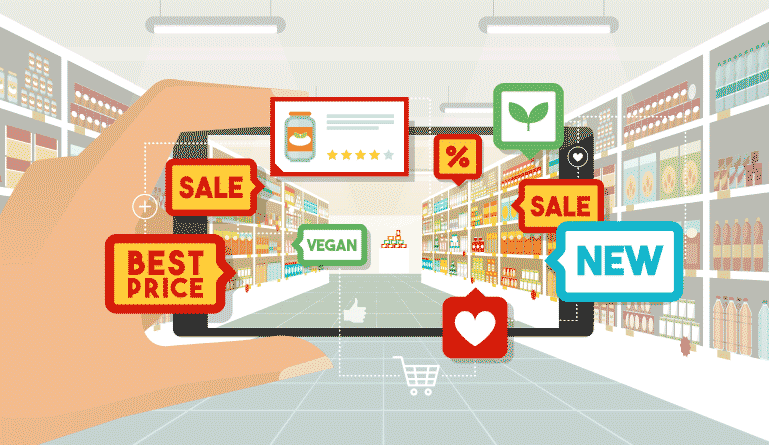
It’s amazing how the state of our brains work. Based on a study conducted by the University of Minnesota, researchers found that the human brain can process visuals 60,000 times faster than they would analyzing text. When deciding if data visualization is the right solution to check analytics for your business, then you’ve come to the right place to consider your options.
What is Data Visualization?
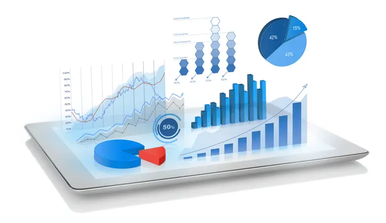
Because pictures are worth a thousand words, it’s better for business managers and other team members who overlook data to process information effectively. Data visualization is simply a graphic representation of data. It’s a great way to communicate systematic mapping with visually appealing charts, maps and graphs. This is not only a straightforward solution to data analytics, but a perfect way to communicate about data within your business.
The Importance of Data Visualization
Not everything has to be complicated. With Data Visualization, having a visual summary of all the information in front of you can help you understand data easily. Because of different data values and outliers depicted on a chart, other members of your team will find it easier to read and recognize patterns within the visualization of data.
How it Works
It’s fairly simple. Once data is interpreted and analyzed from a chart or graph, this will allow more understanding of the information that’s visually provided. The brain tends to process visuals a lot faster than text. Hence, the use of data visualization for your business will help improve how your business looks at information.
Data Visualization Today
Data visualization in today’s world is just as significant as any tool used to effectively run a business. It’s a creative concept that effectively helps the human mind to understand information. Data visualizations can often be seen in presentations, which enable decision makers to view and understand patterns, and come up with concepts for a solution.
Types of Data Visualization
Depending on how you measure your data, providing a graph, map or chart will improve data analysis and be better to understand. Before creating a graph, find out which type of chart and graph is the right fit for analyzing your data. Below are the most common types of data visualizations out there.
-
Column Chart

Column charts are effective in emphasizing the difference between all types of values. These charts are typically depicted vertically in order to show comparisons between different types of categories. This is the best graph to use when comparing simple patterns within different types of products or categories.
-
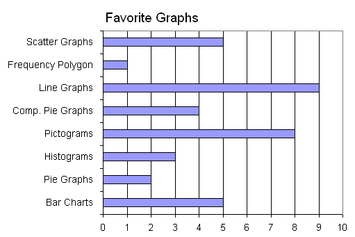
Bar Graph

Just like column charts, bar graphs are often used to compare other items and changes of patterns over time. The only difference is the way it’s depicted, which is typically in a horizontal fashion.
-
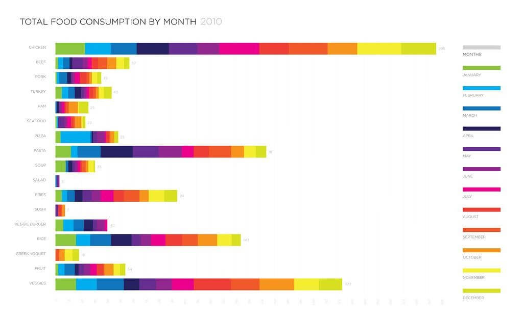
Stacked Bar Graph

Similar to the bar and column graphs, the stacked bar graph is divided up into sub-parts, showing cumulative values of a data item. Each value is stacked up on top of one another by different colors to compare each part. These types of graphs are best for measuring expenditure over time.
-
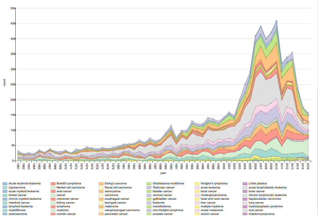
Area Chart

Area charts represent the changes in one or more quantities over time. It’s made through plotting different series of data overtime and connecting those data points through a line segment. From there each area is filled out with different shaded colors.
-
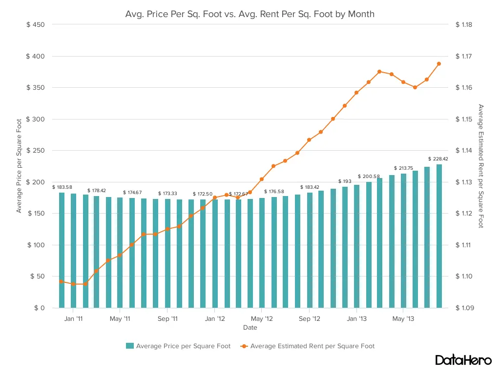
Dual Axis Chart

An axis chart is when two axes are used to illustrate the relationship between two variables that have different magnitudes and scales of measurement. This is to analyze the correlations of each variable.
-
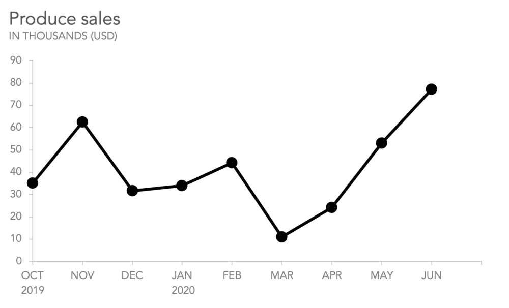
Line Graph

Line graphs are used to show information that tends to change over time. Several points are connected by a straight line to show the patterns between the different types of values.
-
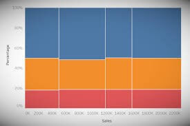
Mekko Chart

Similar to the area and stacked column graph, the mekko chart is a two-dimensional chart that’s stacked on top of each other to measure various segment heights. This chart is used to show relative importance between each bar by adding variables for the width of the bar. Mekko charts show patterns in growth, margin, or market share of product, segment or region.
-
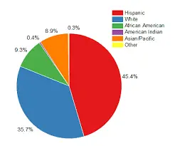
Pie Chart

Pie charts are used to show percentages between each type of category. It’s generally used to show the proportions between those categories. These are best to use if you need to compare six types of categories or fewer.
-
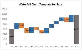
Waterfall Chart

Waterfall charts show forms of data visualization in a cumulative sense. This type of chart helps you understand the sequence between positive and negative values. These charts are typically used for financial purposes such as measuring monthly balances in a checking account, or deposits and transfers.
-
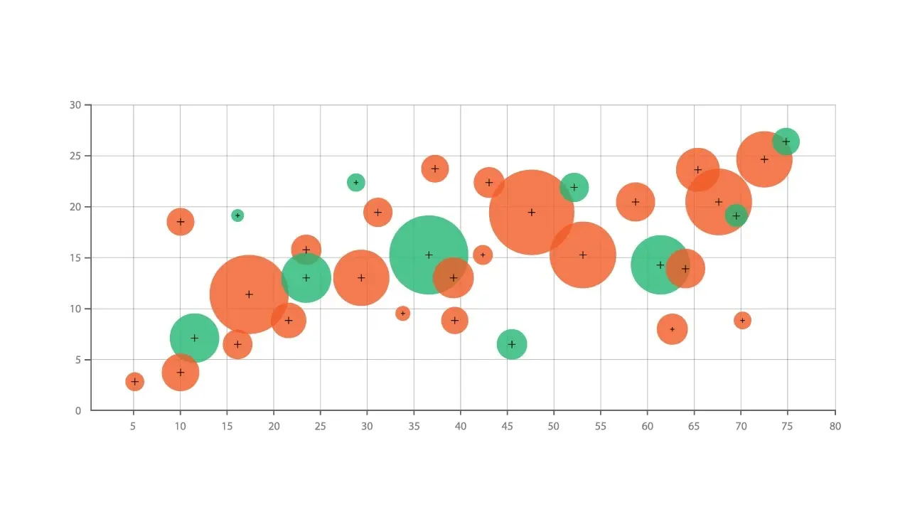
Bubble Chart

Bubble charts are similar to scatter plots and are used to depict the relationships between numeric variables. Depending on its dimension, you should be able to understand the patterns of data within this chart. Bubble charts tend to show the relatedness of different sets of values over time.
-
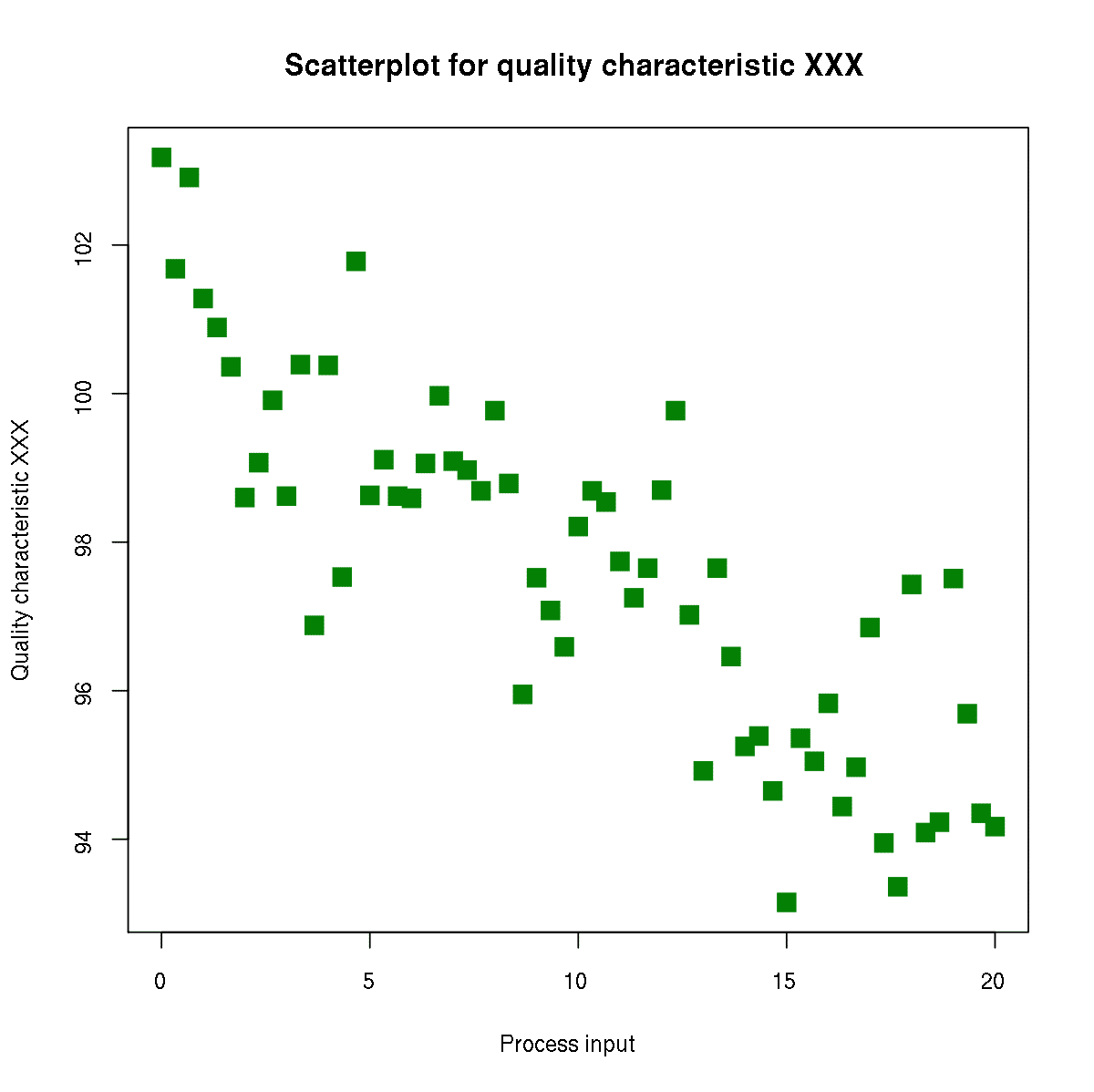
Scatter Plot Chart

Just like the bubble chart, scatter plots are used to measure values for different numeric variables. You can observe the relationships between the variables that are measured on the X and Y axis.
-
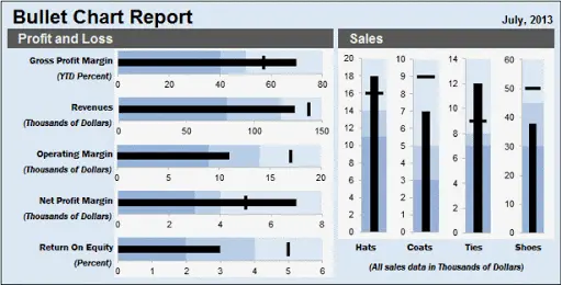
Bullet Graph

Bullet graphs are similar to the thermometer. However, bullet graphs are often used as dashboard gauges and meters. The main purpose of bullet graphs is to measure the performance of a primary measure to other measures provided within the data.
-
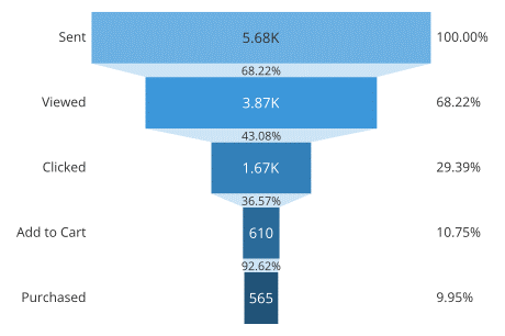
Funnel Chart
Funnel charts help you visualize linear processes that have sequential connected stages. This type of graph is used to track customer growth at different stages.
-
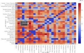
Heat Map

Heatmaps are graphical representations of data using color-coding systems that can represent different values. Used in various forms of analytics, heat maps gather insights of user interactions on a page.
Benefits of Data Visualization
-
Room for Improvement
Data visualizations allow you to fix any problems that you may encounter in your data. Based on the data, providing visual aid with charts and graphs can depict your overall data, but also help and create concepts that can help you improve your ratings.
-
Faster Communication
Because of data visuals, businesses can easily comprehend what’s going on within the data. It provides an effective solution for users. Having a better understanding of what’s going on in a picture of your data will allow you to process your next move to better your business.
-
Builds Connections
It’s no secret that socializing is a key to effective communication. However, because of this pandemic, times have changed. We have come up with different alternatives to modify human interaction, but that doesn’t stop the distribution of data visualization for any type of presentation.
-
Embraces Emerging Trends
When looking into emerging trends, it’s important to keep in mind how you want to approach a situation based on patterns seen on a chart or graph. The collection of data on consumer behavior exposes many opportunities for companies. By using big data visualization for monitoring key indicators, businesses can spot shifts as well as trends within large data sets a lot easier.
Disadvantages
-
Oversimplification of Data
It can get complicated when you try to take big values of data and try to simplify it to make it understandable. This is one of the problems that data visualization can encounter. Once you modify information to make it easier for people to analyze, you may be leaving out other important information.
-
Visualizationo is Inevitable
The most popular tool to use are visuals. It’s a go-to tool for modifying complex data. Although there are other tools available to understand data, using visuals to get your point across tends to be the easiest solution. This can cause limitations in analyzing data and recognizing any human errors.
-
Overreliance on Visuals
Because visuals tend to be a popular tool to turn to, problems can arise especially for consumers. With the overreliance of visuals, this can lead to misinterpretations of information because of how simplified the visual looks. People will tend to take that information as truth, which can lead to misunderstandings of what’s really the bigger picture.
-
Human Limitations of Algorithms
Having limited access due to the algorithm is another problem that data visualization can run into. This will not only be a potential problem, but a very complicated issue. Because most data visualizations are rolled out on a national scale, this can the evolution of a system that fit all types of algorithms. This can lead to failure of addressing specific needs of users and businesses alike.
Tips for Data Visualization
-
Finding the Right Charts and Graphs
The first step in data visualization is finding the right graph to fit all of your data. It’s crucial that using a chart or graph that’s suitable for your data will create a better connection and understanding information. This will lead to helpful business insights and effective decision making.
-
Using Predictable Patterns for Layouts
Using indicators that are pleasing to the eye will keep users engaged by your data. Make sure the format of your data looks easy to understand for your viewers and keep it as simple as possible. It’s better to keep your results straightforward rather than overwhelming for a person. Keep all of your graphs and charts consistent and transparent.
-
Use Color Cues
The use of color is another tip that can effectively help your data visualization. Whether it’s brighter colors or using multiple shades that accentuate important information, highlighting important points of data with a specific color will help engage viewers. Data visualization is all about conveying information without the use of worlds. Hence, this is where colors come in.
-
Use Sizing to Emphasize Values
Yes, size matters. In this case, emphasizing certain values to make a point. Using sizing tools on your data points will help analyze the relationship between patterns and data points. You also want to make sure that the sizing is equivalent as its value.
-
Carefully and Intentionally Apply Text
Text placement is another way to get the attention of viewers. You can intentionally apply text within your graphs and charts as long as it makes sense to your data. Using text where it counts can help improve data visualization and complement a person’s understanding when viewing your data on a chart or graph.
Trends
Because data visualization has been around for a while, a great way to keep up with other businesses is to consider these trends.
-
Going Social
Social media tends to be on the rise with assisting businesses in the digital marketing industry. When integrating social media with data visualization, it’s important to engage users to increase your following. Because it’s not easy to get the attention of users with data, you have to take into consideration that data has to look presentable and visually appealing. A solution to this would be including not only images, but YouTube thumbnails, memes and GIFs.
-
Accessing Data Easily
Providing cloud based access to self-service business intelligence will benefit businesses with improving their data visualization. Offering features such as drag and drop functionality and creating customized dashboards will help empower users to access and analyze data.
-
Creating Meaningful Insights
Being genuine is a bonus when it comes to presenting data visualization. Although it’s been said that a picture is worth than a thousand words, having a story to tell while showing the importance of data sounds can be more promising. Try creating interesting and simple stories from complex data, that way it can keep you two steps ahead of the game.
-
Bringing A.I. into Action
Almost every type of platform is currently inviting A.I. into their marketing strategies. Because it can be a game-changer, A.I. causes businesses to become smarter than ever. Having data visualization powered by A.I. will not only assist your business in finding information that they’re looking for, but rather suggest what you should be looking for to benefit your business.
-
Invest in Multi-Device Support
Having the ability to be available on multiple devices for data visualization will allow your business to reach out to mobile users. It’s important you expand availability to all your users using both a desktop and a mobile device because this will enhance your chance to create the same experience of data visualization for everyone.
Final Thoughts
The importance of data visualization can help you dominate marketing shifts and consumer behavior. Not only that, but the use of data visualization can easily help other businesses leaders understand and effectively make decisions to improve their marketing strategies. In essence, data visualization is a common way to engage others who are overlooking data and trying to understand the patterns. It can be helpful but complicated at times depending on what kind of data you’re analyzing. Depending on how you measure your data, it’s also important to think about the types of graphs you should use to present to other people within your company. You want to make communication between you and your peers straightforward and engaging.
Knowing about what the next steps you take is inevitable when working in the digital marketing industry. You have to move fast and figure out solutions to succeed.